What is a productivity dashboard and how can I use it?
A productivity dashboard is a summary view of your activities measured against the resources spent on those activities. They come in many different forms: tables, charts, pictures. In general, you’d want to have one if you need to know how much time/money/other resources you need to spend to get a particular desired result. This is exactly what productivity is about: spend less, gain more.
Who uses productivity dashboards?
- Owners of a business
- Executives
- Managers
- Team leads
- Analysts
If you own a business it’s crucial for you to know its effectiveness. You might also be interested to compare your employees’ productivity. Executives find it useful to have an overview of their project in a single-page form. Managers can learn from a productivity dashboard if there’s a need to make any changes to the established processes or not. Team leads will be interested in understanding their team capabilities. And analysts obviously need to know all aspects of a project they are working on.
What does the productivity dashboard look like?
You may use tables or different charts to measure your business or team productivity. Composing them with the data from different sources is time-consuming and sometimes causes errors. However, it’s still common to create tables and charts in Excel, for example.
With the spread of online work tools, it’s more common to have your productivity dashboards online as well. One of the most widespread work office kits is Google Workspace (G Suite). G Suite users create their productivity dashboards using Google Data Studio. This app can take data from your Google Spreadsheets and create nice visual dashboards out of them.
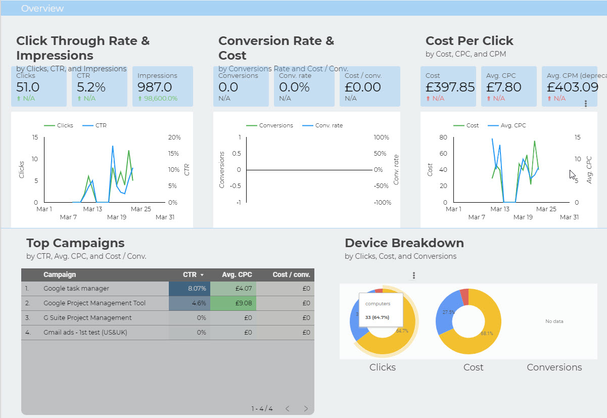
Related article: 10 Time Saving Productivity Dashboard Templates That Will Make You a Productivity Ninja
How can I reduce data sources?
If you are using many apps to manage your projects it becomes complicated to create your dashboards. You may forget to download data, you may get errors. As a result, you don’t have enough reliable data to make important decisions. If that’s your case, consider switching to one app that may serve you as the ultimate data source.
Kanbanchi is a task and project management app that is integrated with Google Workspace. Hence you may export all data from Kanbanchi in a form of a Google Spreadsheet and then create your productivity dashboard based on these exports. More than that, Kanbanchi won’t only be a data source but will become a productivity dashboard itself.
It’s a rare case when someone needs to see just the overview. Seniors and owners do but the majority of employees would need a more detailed view than just what Google Data Studio shows. And Kanbanchi will be their detailed productivity dashboard. Kanbanchi has a built-in Gantt chart that can be used to see the details of a project but still in a form of a single-page compact view, a sort of productivity dashboard but containing more details.
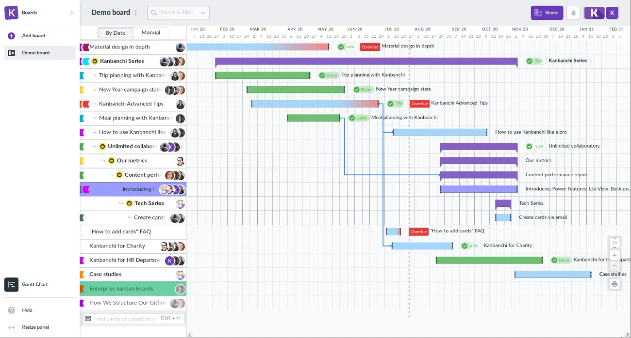
Companies using Kanbanchi as their corporate app for project management reduce their effort for dashboards creation by 45% due to the option of exporting data from their Kanbanchi board to Google Spreadsheet and then using Google Data Studio.
Check out more articles about different productivity tools here