Try Kanbanchi now
Start your free trial


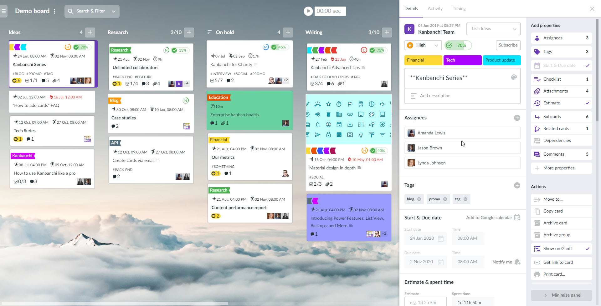
We thought long and hard before releasing a new card panel in Kanbanchi. Let’s be honest, this release was one of the toughest to do. However, we know that it was also the most eagerly awaited by our users, as well as being something that our team was keen to get sorted out.
This change is the second one after the new navigation panel that will lead to a series of significant changes. These are the changes that will make your experience with the app better, by making the work process easier.
The new card panel has all the details on the right, so that you may easily pick anything that you want to add to your card or quickly switch between those elements already added.

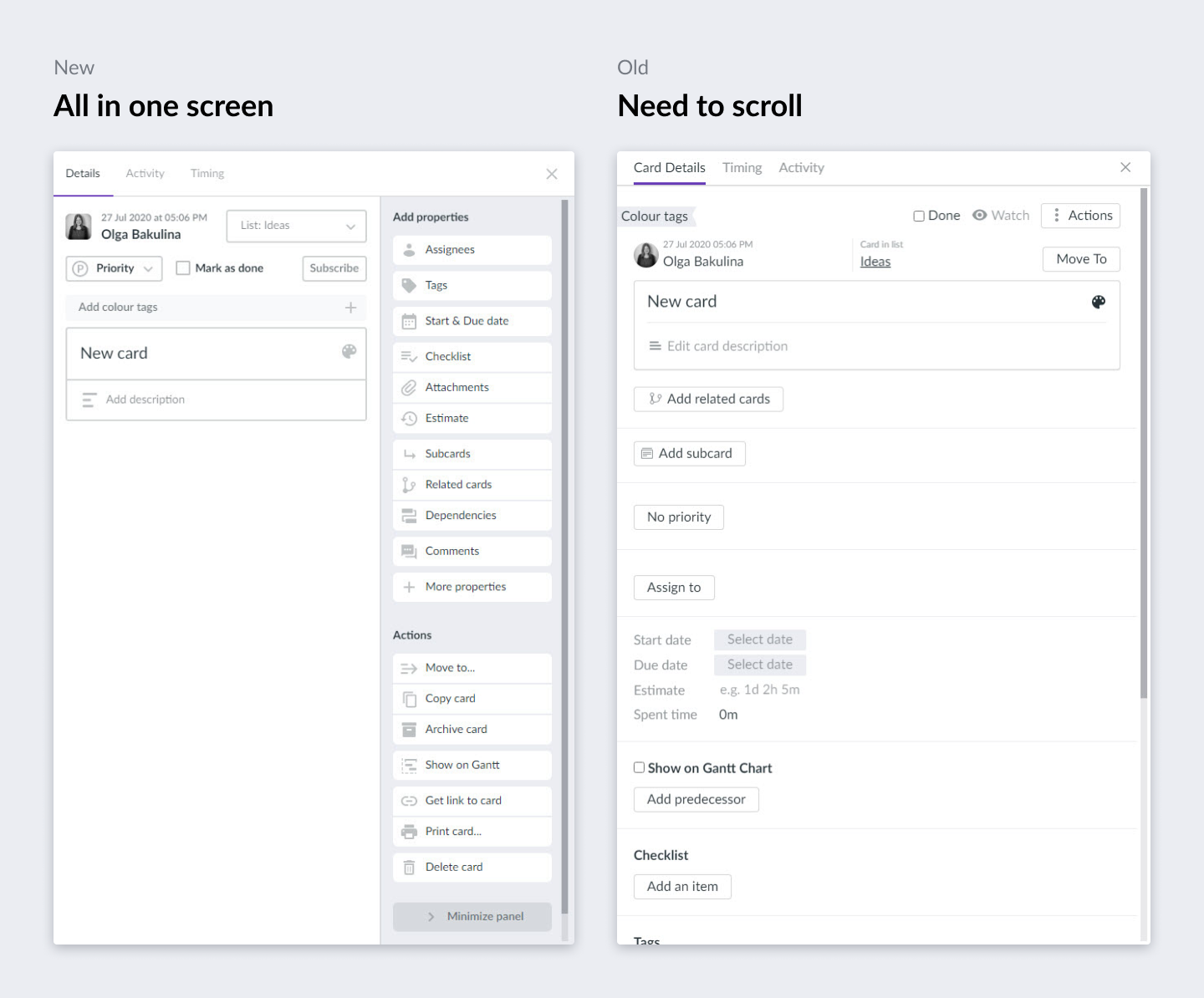
When you create a new card, you don’t need to scroll to see all the available options. They are all visible, and you can add them in one click. Easy to start – easy to go!
When you compare the old and new designs, you will see that new cards can be created more easily. Newcomers and advanced Kanbanchi users can all start adding new cards now with no fuss or delay.
Check out this new article to learn more about the UI changes on the Kanban board that we plan to introduce in the future. The key benefit is that all these changes increase usability, as we want our users to be happy with the product.
We hope you enjoy the new Kanbanchi look and will be glad to receive your feedback in comments or to our support email.
Check out previous releases:
Team performance chart
Team Workload view
New navigation panel


Start using Kanbanchi now
Start your free trial