Try Kanbanchi now
Start your free trial


Recently, we’ve introduced a series of significant changes to the Kanbanchi UI (including a new kanban board UI) to make it more convenient and help you to be more focused on what matters most – your work.
We believe that the project management app should be designed to support your workflow but not to become part of your workflow. You can learn about the changes that we’ve already released by following these links: new navigation panel, new card panel. Also, we constantly make small changes that make the interaction with Kanbanchi ever more pleasant.
We believe that lots of small things combined together form that great overall experience that we all expect from apps. And it’s only possible to achieve through constant improvement.
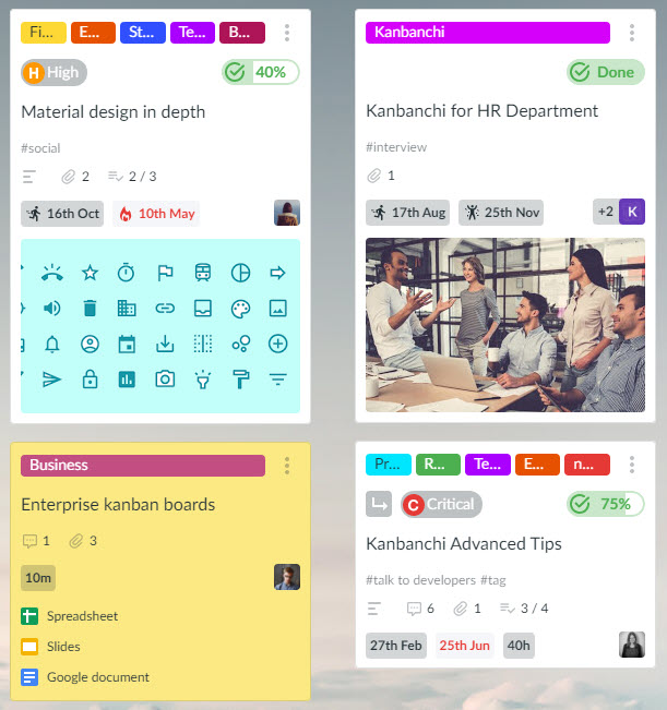
First of all, its main elements – cards, and all the icons used on these cards. We reviewed the usage of all card details and found the most important elements, like colour tags, priority and due dates.
We took these elements and made them more visible on cards. Take a look at the current design below.
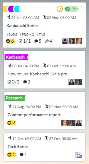
What issues does the new design solve? Well, in the past it wasn’t possible to see the names of colour tags when there was more than one on a card. It was also awkward for some users to quickly understand that the H icon meant high priority, and it was sometimes difficult to identify the due date immediately.
Compare this to the new version that we plan to implement. The changes resolve all the matters mentioned above and lead to a far smoother and more intuitive process for our users to enjoy.
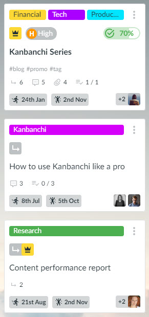
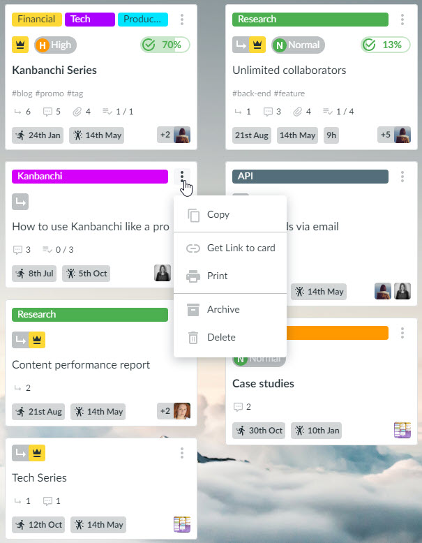
By the way, did you notice that we added a subcard sign too? Yes, now you will be able to understand whether a card is an Epic or subcard (or both). Another little helpful thing is an option to perform quick actions with a card without opening it.
We are eager to see how our users react to trying the renewed interface for the first time. Let’s unwrap some more details to show you what to look forward to.
Attachments will be pinned to the bottom of the card. This is to ensure that they don’t distract you from the main information while still making a useful addition to cards on board. Check out the difference in the images below to see the effect this has.
Current attachments positioning.
Upcoming attachments positioning.
No, of course, not. We just don’t want to spoil all of your surprises. You will soon see it and will be able to test it with your real work. Now you can look at the board and try to find all the small details that are going to change.
We will be glad to receive your feedback in comments or to our support email. Please, share any thoughts that come to your mind regarding the Kanban board appearance.
Check out previous releases:
New card panel
Team performance chart
Team Workload view


Start using Kanbanchi now
Start your free trial