
FAQ
- Reports
- 2. How can I create the Team performance report in Kanbanchi?More
You may create the Team performance chart in Kanbanchi. It shows your team members’ progress in getting tasks done.
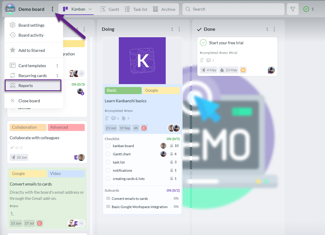
To create the team performance chart, open the board you need and switch to Reports by clicking the three dots next to the board title and choosing Reports.

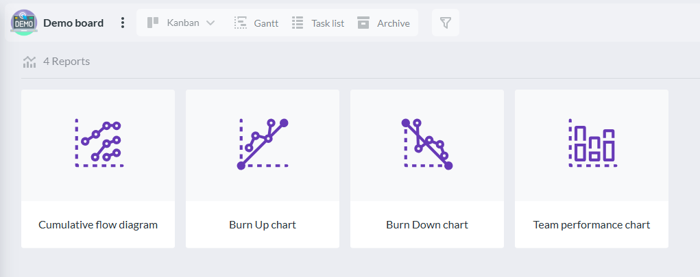
Click Team performance chart.

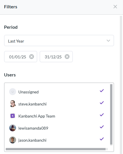
Start with choosing the period of time to create your report, and then choose which users to include to the report.

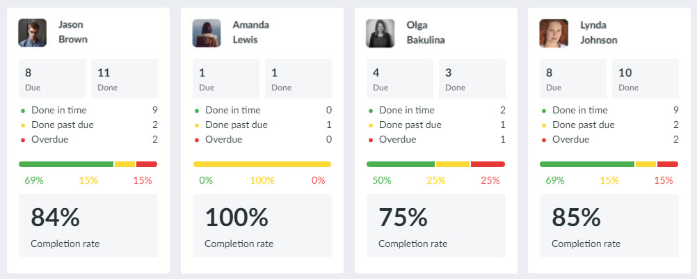
On the chart, you will see the number of cards that are done in time, past due and the number of cards that aren’t done and therefore are overdue.
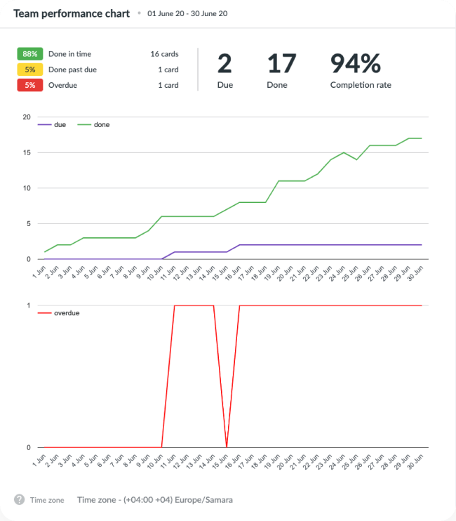

Done in time means that they were completed before their due date during the chosen period.
Done past due means that they were completed after their due date during the chosen period.
Overdue means that their due date came during the chosen period and they weren’t completed during the chosen period.
Due means that their due date is within the chosen period.Also, the overall completion rate is indicated. It shows how many tasks of all due tasks were completed during the chosen period. Also, you will see the performance of each individual user.
- 3. How can I create a burn down chart in Kanbanchi?More
You may create a burn down chart in Kanbanchi. With the help of it, you’ll see the done work and may predict when the whole scope of work will be completed. The outstanding work (or backlog) is often on the vertical axis, with time along the horizontal.
Switch to Reports by clicking the three dots next to the board title and choosing Reports.
Choose the Burn Down chart.
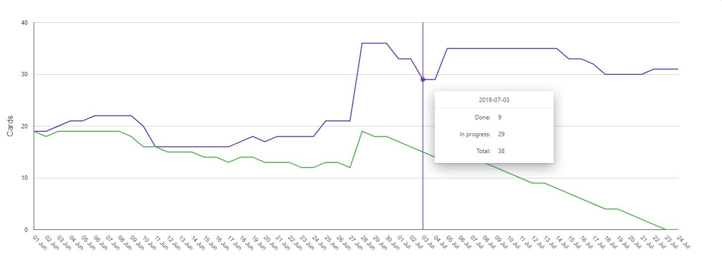
Each coordinate corresponds to the number of completed tasks at each stage of the process for the corresponding day. Each graph describes the behaviour of the cards in a particular list, namely, it shows the number of cards in the list for a period of time.
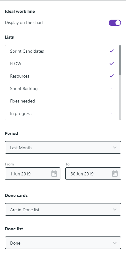
You may choose what lists to display on the chart and a period of time. Also, you may choose to show the ideal work remaining line and how to define done cards.
Hover the cursor alongside the chart lines to see the information about the particular date.
- 4. How can I create a cumulative flow diagram in Kanbanchi?More
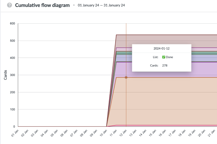
You may create a cumulative flow diagram in Kanbanchi to check the state of the work scope. The diagram shows the work state transformation within a period of time. The number of cards is shown on the vertical axis with a timeline being on the horizontal. The diagram shows the number of cards in each list at a particular point in time.
To create the cumulative flow diagram, open the board you need and switch to Reports by clicking the three dots next to the board title and choosing Reports.
Choose Cumulative flow diagram.
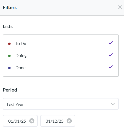
You may choose what lists to display on the diagram as well as the period of time.

Hover the cursor alongside the diagram lines to see the information about the particular date.
- 5. How can I create a burn up chart in Kanbanchi?More
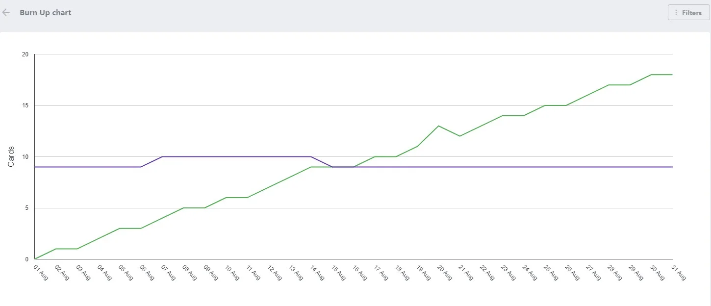
You may create a burn up chart in Kanbanchi. It will help you to compare the number of completed tasks with the overall work scope. The number of completed tasks is on the vertical axis, with time along the horizontal.
Each coordinate corresponds with the number of completed tasks at each stage of the process for the corresponding day. Each graph describes the behaviour of the cards in a particular list, namely, it shows the number of cards in the list for a period of time.
To create the burn-up chart, open the board you need and switch to Reports by clicking the three dots next to the board title and choosing Reports.
Click Burn up Chart.
You may choose what lists to display on the chart and a period of time. Also, you may choose to show the ideal work remaining line and how to define done cards.
You may choose how done cards should be recognized and what list should be considered as done.
Hover the cursor alongside the chart lines to see the information about the particular date.
Reports are available with the Professional plan subscription.
